New Features in ggplot2 4.0.0
July 16, 2026
The ggplot2 package recently had a major release that coincided with its 18th anniversary! The ggplot2 4.0.0 release includes dozens of improvements ranging from theme customization and scale enhancements to new geom capabilities. This post highlights a few of the updates that I found particularly useful.
Themes
Ink and paper
Users now have a quick and intuitive way to style plot colors using the paper and ink arguments available in ggplot2 themes. paper controls the background color of the plot, while ink controls the foreground color used for the more informative elements of the plot such as text, lines, and other key visual components. The exact aesthetic associated with ink depends on the type of chart. For a boxplot, the primary foreground element is the box outline, so ink is typically applied through the colour aesthetic. In a histogram, however, the filled bars carry the information, making fill the primary “ink.” Rather than remembering whether a particular geom relies on colour or fill, users can simply think in terms of visual roles: the background (paper) and the most important information (ink).
In the boxplot and histogram below, the same ink and paper settings are used in both plots. However, the foreground, or ink, information is represented differently in each chart. For the boxplot, the outlines and outliers are the most informative aspect, while for the histogram, the bars carry the information. The ink setting allows themes to adapt to these differences automatically.
library(ggplot2)

diamonds |>
  ggplot(aes(carat)) +
  geom_boxplot() +
  theme_bw(paper = "snow", ink = "orchid4")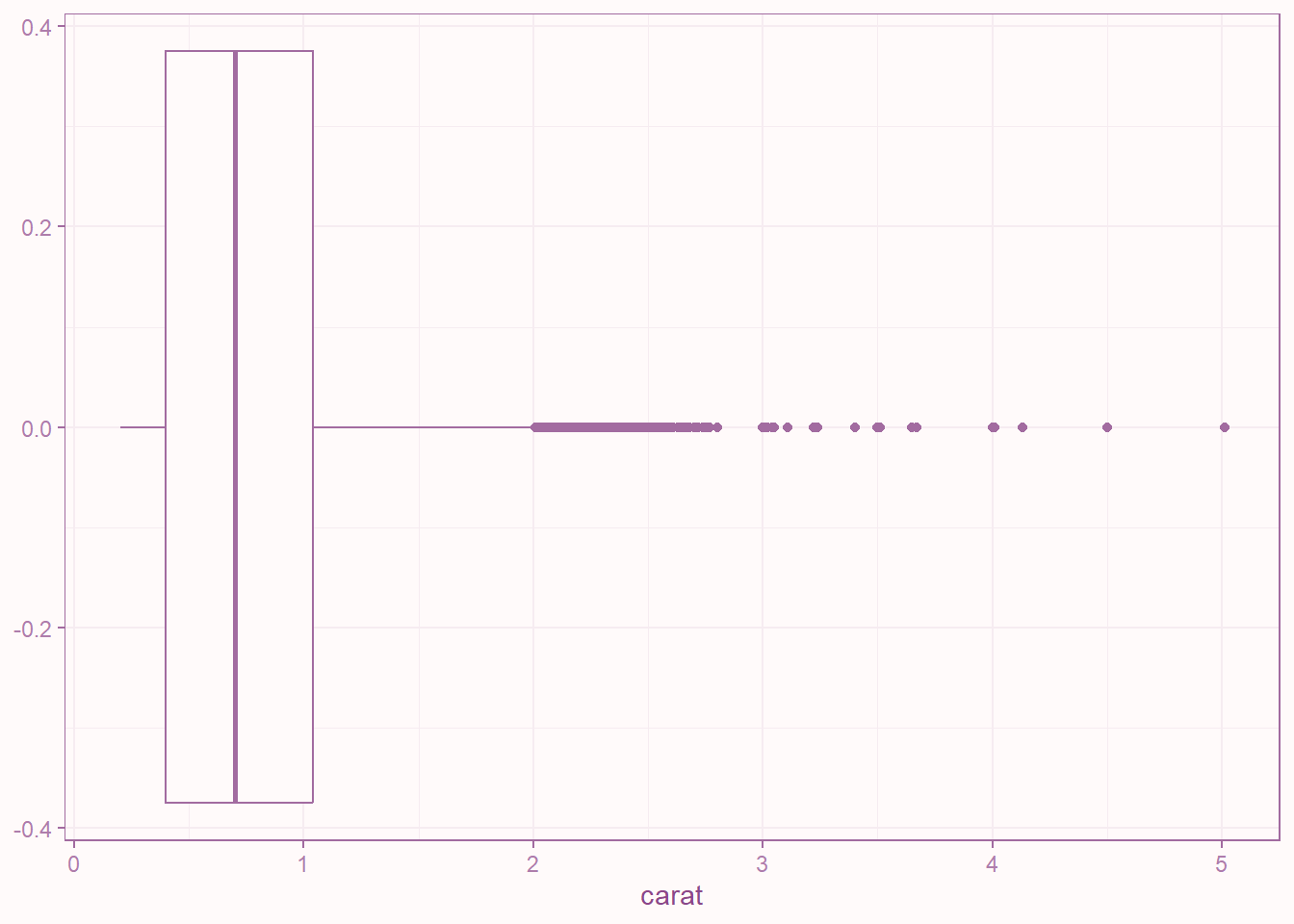
Figure 1: In this boxplot, ink changes the color of the boxplot outlines and outlier points.
ggplot(diamonds, aes(carat)) +
  geom_histogram() +
  theme_bw(paper = "snow", ink = "orchid4")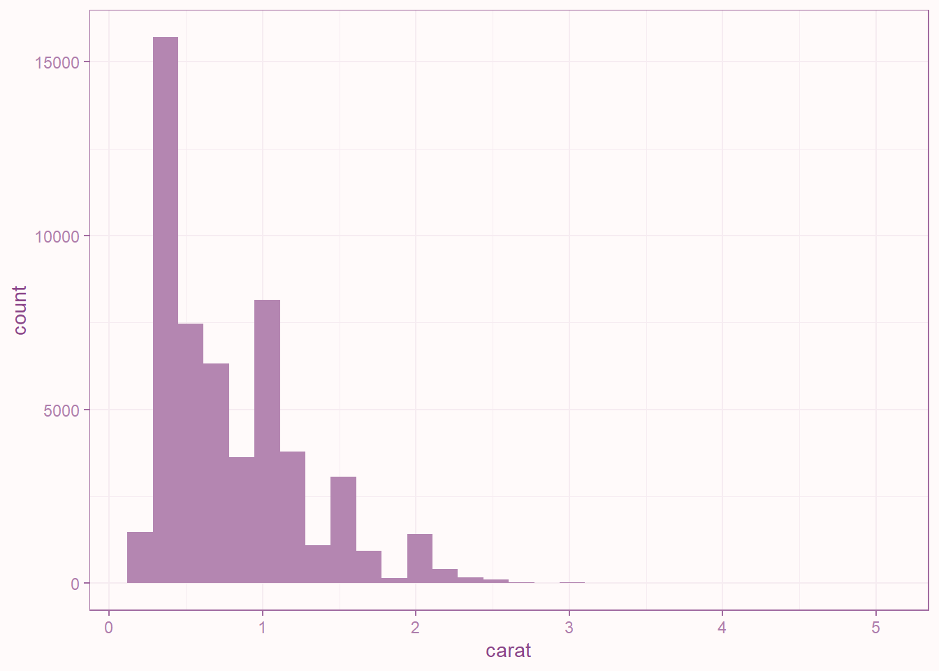
Figure 2: In this histogram, ink changes the color of the bars themselves.
Scales and Palettes
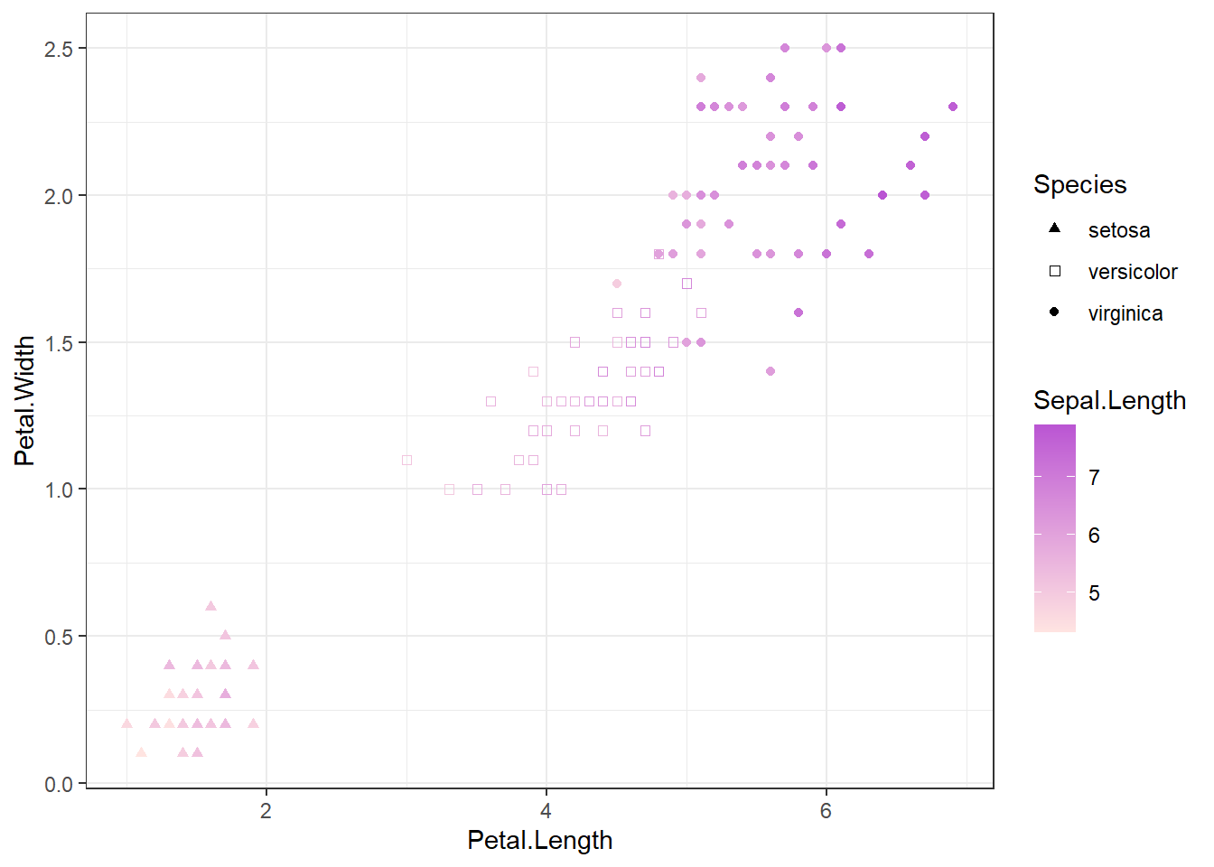
Another enhancement to ggplot2’s theme system is the ability to define default palettes directly within a theme. Previously, color and shape palettes had to be specified separately using scale functions, such as scale_color_continuous() or scale_shape_discrete(). By incorporating palettes into themes, users can control the overall look and feel of their plots in one place, rather than configuring theme settings and color scales separately.
iris |>
  ggplot(aes(
    x = Petal.Length,
    y = Petal.Width,
    shape = Species,
    colour = Sepal.Length
  )) +
  geom_point() +
  theme_bw() +
  theme(
    palette.colour.continuous = c("mistyrose", "mediumorchid"),
    palette.shape.discrete = c(
      "triangle",
      "square open",
      "circle"
    )
  )
Plot Sizes
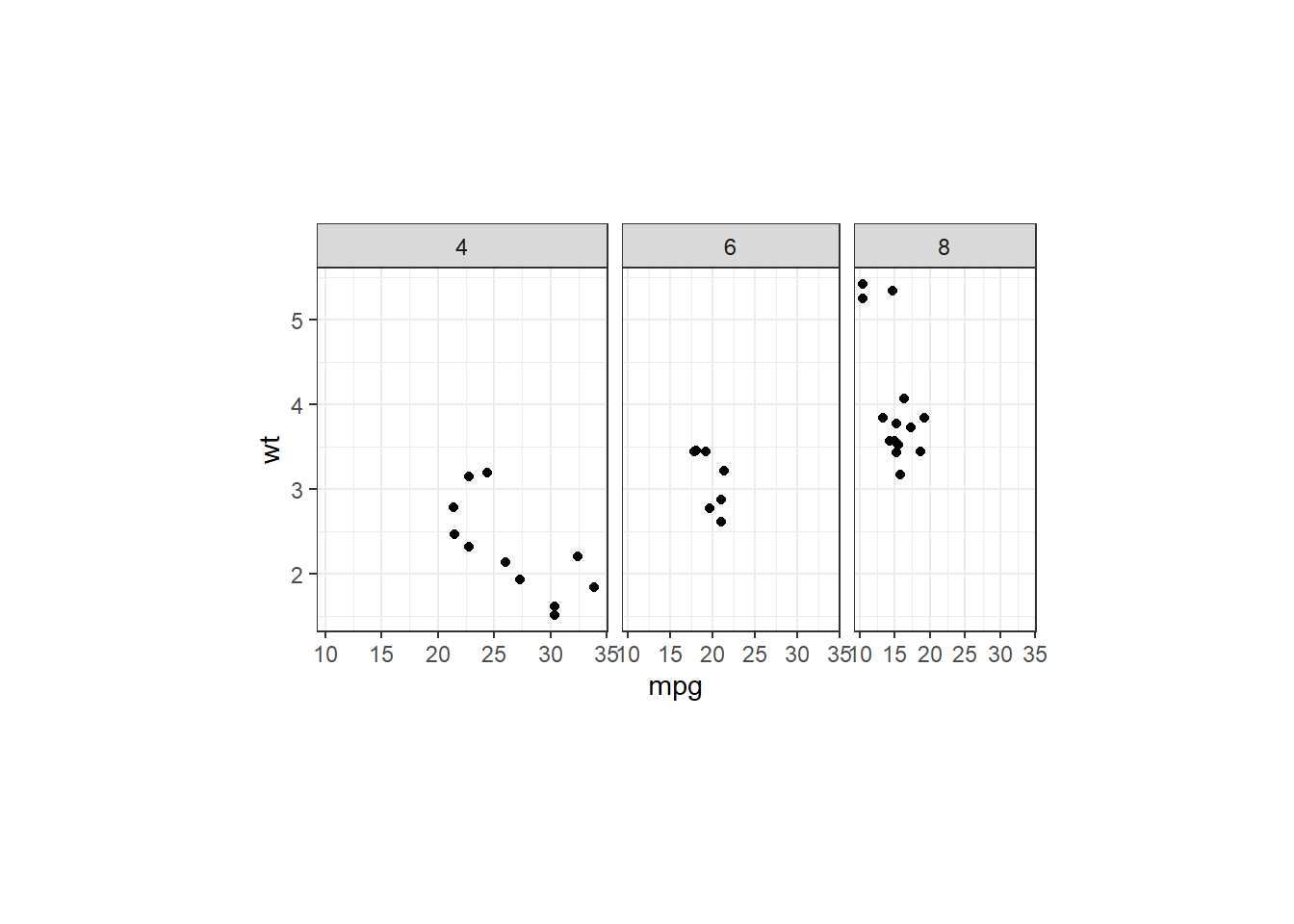
ggplot2 now makes it easier to control the size of plot panels using the panel.widths and panel.heights theme settings. Unlike ggsave(width, height), which controls the size of the entire plot, these settings control only the plotting area itself. Users can either specify sizes for individual panels or provide a single size for the entire panel area. This is especially useful for faceted plots, where panel dimensions often need to be adjusted independently of the overall figure size.
The ggplot2 release also introduces a family of theme shortcut helpers that make theme code more readable by grouping related settings. For example, theme_sub_panel() provides a concise alternative to setting panel.widths and panel.heights directly.
ggplot(mtcars, aes(mpg, wt)) +
  geom_point() +
  facet_grid(. ~ cyl) +
  theme_bw() +
  theme(
    panel.widths = unit(c(4, 3, 2.5), "cm"),
    panel.heights = unit(5, "cm")
  )
  # or as a shortcut: +
  # theme_sub_panel(
  #   widths = unit(c(4, 3, 2.5), "cm"),
  #   heights = unit(5, "cm")
  # )
Secondary Axes
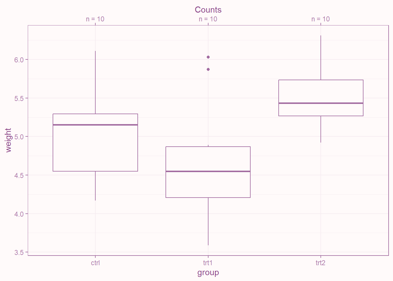
It is now possible to add a secondary axis to a discrete scale. Previously, secondary axes were only available for continuous position scales. ggplot2 now extends secondary-axis support to discrete scales via dup_axis(), making it easier to add labels and annotations to categorical axes without resorting to custom workarounds.
ggplot(PlantGrowth, aes(group, weight)) +
  geom_boxplot() +
  theme_bw(paper = "snow", ink = "orchid4") +
  scale_x_discrete(
    sec.axis = dup_axis(
      name = "Counts",
      breaks = seq_len(length(unique(PlantGrowth$group))),
      labels = paste0("n = ", table(PlantGrowth$group))
    )
  )
Boxplot Customization
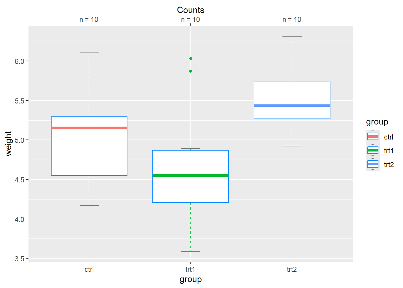
Boxplots are now more customizable than ever. In addition to outlier styling, geom_boxplot() now lets users control the appearance of the median line, box, whiskers, and staples, including their colours, line types, and widths.
ggplot(PlantGrowth, aes(group, weight, color = group)) +
  geom_boxplot(whisker.linetype = "dashed",
               box.color = "dodgerblue",
               median.linewidth = 1.5,
    staplewidth = 0.25, # show staple
    staple.colour = "grey50") +
  scale_x_discrete(
    sec.axis = dup_axis(
      name = "Counts",
      breaks = seq_len(length(unique(PlantGrowth$group))),
      labels = paste0("n = ", table(PlantGrowth$group))
    )
  )
Final Thoughts
These are just a few highlights from the ggplot2 4.0.0 release. The update contains many additional improvements and bug fixes that are worth exploring in the full release notes.
- Posted on:
- July 16, 2026
- Length:
- 4 minute read, 748 words
- Tags:
- ggplot ggplot2 plotting visualization
- See Also: